No Limit Agency powers Safeguard's growth with best in class B-to-B Website Design.
Client: Safeguard
About our Work
Right now, there’s a paradigm shift happening in website design—one where websites are finally unleashed from outdated conventions and given the freedom to fully tap into the digital platforms they’re built on. Archaic elements are being kicked to the curb and instead utilizing unique web-native experiences to not only draw in visitors, but to entice them to stick around, too.
That’s exactly why Safeguard’s Business Acquisitions and Mergers team approached No Limit Agency’s digital department back in 2016. Realizing the need to update their existing website design by making it more responsive, more intuitive and more interactive, Safeguard wanted to simplify its complex multi-page experience into a streamlined landing page—one that would look great and operate smoothly on just about any device imaginable.
“Safeguard came to us with one key objective—to tell their story in a more captivating way. A brand’s website provides the best vehicle for delivering messages that are not only heard and understood, but that inspire, motivate and elicit action. A well-designed website can also free brands from the constraints of traditional media and advance the art of storytelling. It can create captivating, immersive, interactive and emotional experiences that move people,” said Nick Powills, the CEO of No Limit Agency. “That was our approach designing Safeguard’s new online identity, and it started with simplifying the user experience.”
Today, when you land on the average website, you are greeted with a few prominent trends: a large image slider, a top or side navigation, a main body of text and a sidebar with various link. In other words, it can be a scattered, inelegant and blunt experience. With this in mind, No Limit Agency’s team of designers realized that to truly make Safeguard’s website standout, they needed move away from the multi-layered navigation and create a one-page website design. This way, visitors are immediately immersed in the opening lines of a great story. The ultra-simplified design gets out of the visitors’ way and Safeguard’s story takes center stage for the entire journey through the site. The only thing the visitor needs to do is the most natural and intuitive thing on the web: scrolling.
“This simple action is something we’ve all grown accustomed to in the age of Facebook and Instagram. It allows for a seamless experience devoid of link hunting or any other type of point and click guesswork,” said Michael Palm, No Limit Agency’s senior project manager. “This format also forces the website owner to distill their vision into one page, making the messaging clearer and more powerful. We’re ultimately giving the user a more satisfying experience, telling a better story and doing it in a simpler way.”
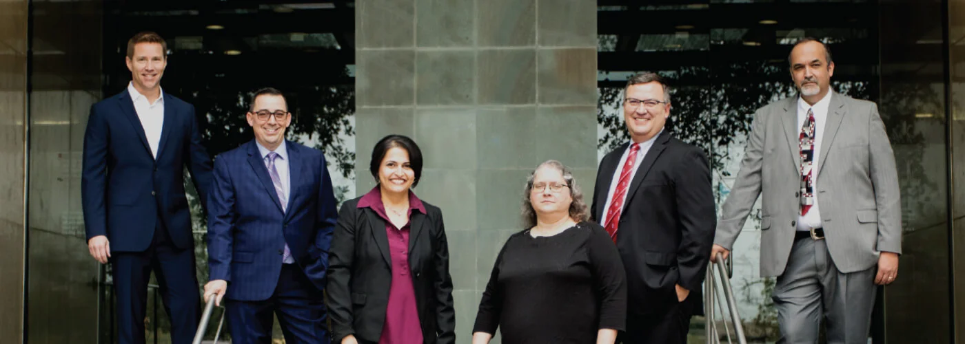
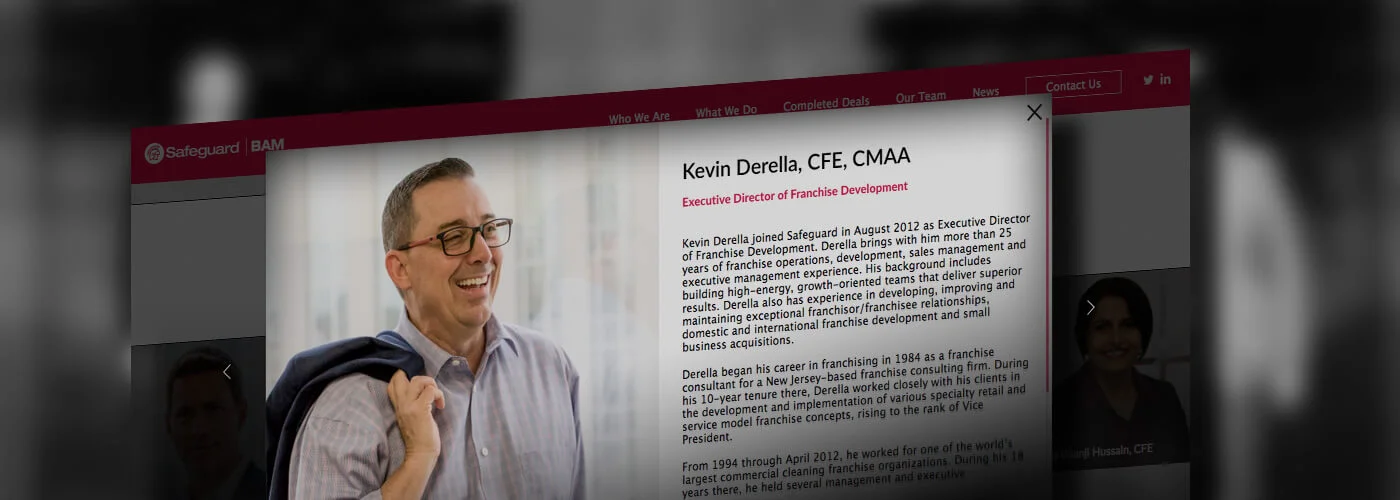
Driving Safeguard’s new website design and user experience is a compelling narrative. No Limit Agency’s writers were tasked with leading visitors through Safeguard’s story in an intriguing and easily-digestible way. Because Safeguard’s strategy revolves around bringing together world-class companies with their market leadership, a major part of this narrative required putting a human aspect behind the business. Which is why, today’s visitors will not only get an explanation of what Safeguard does and who they’ve worked with, but who they are on a personal level. This was achieved through an interactive biography section that allows visitors to get to know each Safeguard executive one-on-one.
With the primary objective of generating business leads, Safeguard’s new one-page website design ultimately made it easier for the company to broadcast its call to action. After visitors reached the end of Safeguard’s journey, they’re naturally guided to the website’s contact form where they can learn more information and kick off the early stages of a lasting conversation.
“Every website should have a primary objective. Whether it’s to generate new leads, to promote a person or product or to sell more goods and services, single page websites are the best at delivering real results,” Powills said. “Safeguard’s new website features a simple, straightforward design combined with a great story and visceral interactions. In the end, this will propel site visitors along a single path towards that final goal.”


